
Will Thomas
Gaia’s flagship product didn’t fit the US market. So I made something new.

When Gaia made the bold decision to expand into the United States, the rationale was clear: There are more IVF dollars spent in Manhattan alone than in the whole of England. In a country without a national health service, where treatment is not only significantly more expensive but also far more frequent, we saw a profound opportunity to further Gaia’s mission, giving everyone who wants to try, a chance at making a family.
Our flagship UK product, Leto, had been designed around the context of the NHS: Most of our British members had already gone through at least one cycle, typically funded by the public system. This meant they often arrived at Gaia with a working understanding of the IVF process. In contrast, our early research indicated that many American prospects were first-timers, overwhelmed, under-informed, and often deeply anxious. Some had even sold their homes to fund treatment.

So we needed to translate a complex, structured product into an experience that met users where they were, emotionally, financially, and informationally, without compromising Gaia’s core tenets of Transparency, Control, and Protection (or, as we often called them, TCP).
Task
- Convert self-paying (cash) buyers: These were individuals not covered by insurance, who traditionally turned to credit cards or personal loans to fund treatment.
- Improve credit acceptance: Since our product included financing, every prospect needed to pass a credit check. Poor fit here risked wasting users’ time and damaging trust.
- Identify high-intent users early: IVF decisions are deeply personal and slow-moving. We needed to calibrate our experience to support those ready to start within the next 3 months, without losing others entirely.
- Educate without overwhelming: The US audience had less baseline knowledge about IVF, and our product’s structure added another layer of complexity.
This wasn’t just a UX challenge. It was a systems design challenge, a brand challenge, and, in many ways, an ethical one.
Approach
1. Listen first. Design second.
We began with moderated user testing, inviting American prospects to interact with Leto as-is. Their responses were telling: while they appreciated the intention, the complexity created cognitive overload. Too many unknowns, too soon.
2. Progressive disclosure over immediate detail.
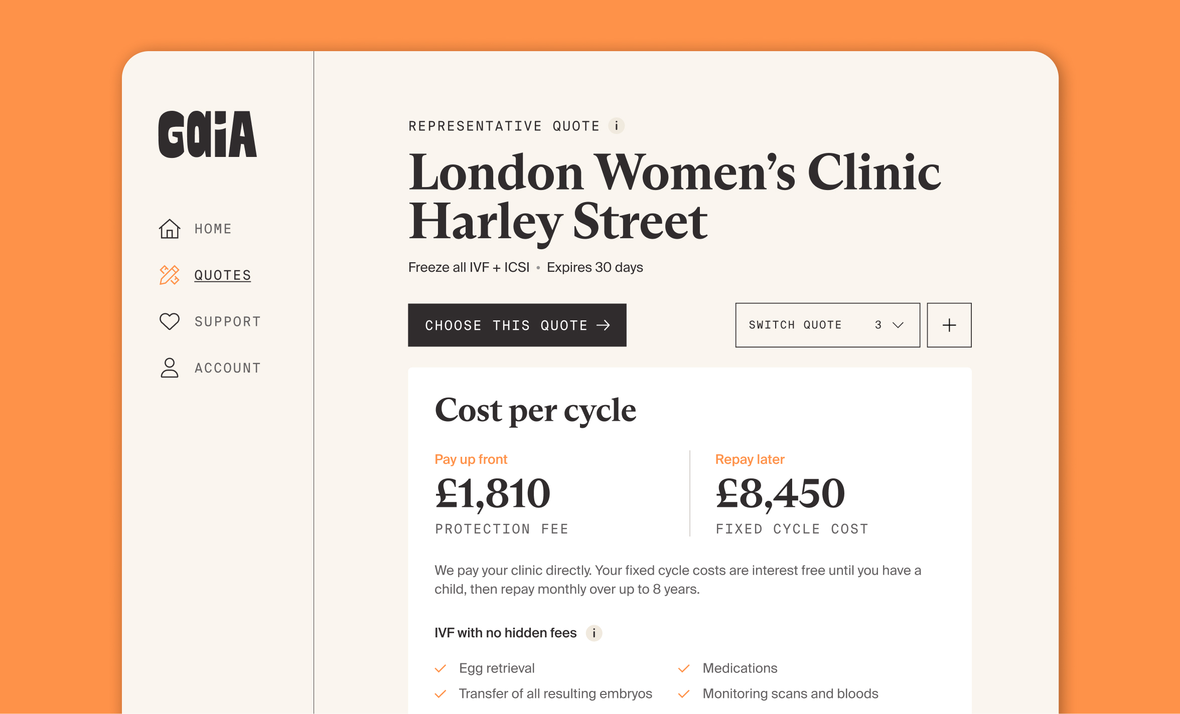
To combat overwhelm, we restructured the quote flow. Instead of dropping all information on a single page, we staged it, revealing only what was necessary, when it was necessary. This mirrored the emotional cadence of IVF itself: step-by-step, decision by decision.
3. From fixed packages to a modular product builder.
We began to experiment with giving users the ability to build their own packages. They could select the number of cycles, choose whether to include medications, and configure repayment terms. This not only put them in control but also created space for new offerings like IUI, egg freezing, and embryo batching, expanding our appeal and flexibility.

4. Rapid iteration through no-code prototyping.
Using no-code tools, we prototyped and shipped fast. Each version taught us something. Each sales call became another data point. This loop; test, call, learn tweak, was the engine I knew we needed.

5. Rethinking the credit check.
Credit ineligibility rates in the US were higher than anticipated. By moving the credit check earlier in the journey, we could better qualify users upfront, avoiding disappointment later and conserving internal resources.
6. Optimising for conversation.
While the long-term goal was a self-serve experience, we prioritised routing users to sales calls early. These conversations gave us raw, unfiltered insight, especially into how users interpreted our product builder, and where confusion still lived.
Impact
- 5% conversion of the total addressable market across pilot states between November 2024 and January 2025.
- 90% increase in our addressable market by moving beyond Leto to a modular, inclusive product builder that included adjacent fertility services.
- Marked improvement in engagement from first-time IVF patients, who responded positively to the increased control and customisation.
- Reduced customer confusion and increased trust by repositioning credit checks and progressively disclosing information.
Reflection
This project reminded me that design isn’t just about simplification, it’s about attunement. We weren’t just translating a product into a new market. We were translating it into a new emotional context: one of uncertainty, financial anxiety, and fragile hope.
What made the difference was staying close to our values, Transparency, Control, Protection, but flexible in how they were delivered. We let go of the rigid structure of Leto not because it was broken, but because it no longer fit the context. And by doing so, we made something new, something better suited, without losing who we were.
It also underscored the power of fast, ethical experimentation. Rapid iteration, driven by direct contact with real people, helped us learn faster and design with empathy. And while our no-code tools showed their limits over time, they gave us the speed and clarity we needed in those critical early months.
Reimagining a complex offering into a modular experience, balancing transparency, control, and protection while designing for a new cultural and emotional context.