

Will Thomas
Families were starting their journey, then getting stuck. I got them moving again.
IVF is a deeply personal and often overwhelming process. At Gaia, we saw families investing time and emotion only to hit confusing roadblocks; unclear next steps, vague terminology, and complicated forms. My role was to understand where the experience broke down, then redesign it to restore clarity, confidence, and momentum. This case study explores the UX and UI changes I made to transform the onboarding journey from confusing to confident, and how we used thoughtful product design to guide families through one of the most important decisions of their lives.
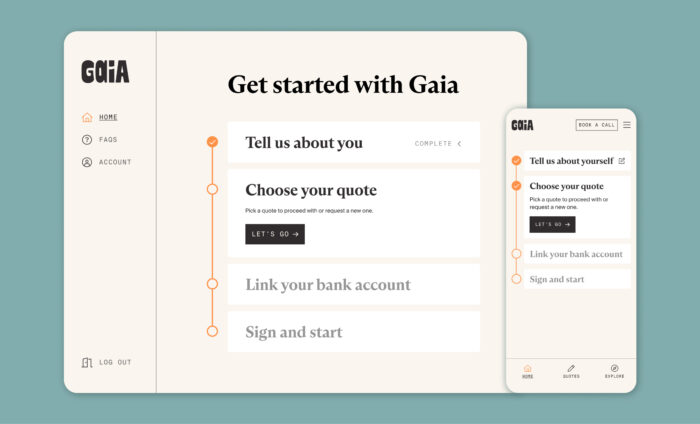
After submitting their health data, members didn’t know what came next. I redesigned onboarding as a clear, step-by-step journey.
I introduced a dashboard that laid out onboarding as a timeline. This gave members a reliable place to return to and helped them track progress at a glance. It also made the process easier to evolve; we could reorder steps or add new ones as needed. For instance, we moved the credit check to the start of the flow, helping filter out non-serious applicants earlier, rather than relying on sunk cost to push people through.
Members needed reassurance after sharing sensitive health data. I created a customised fertility report to deliver early value and build trust.
Submitting a health profile is a vulnerable moment—members share intimate details of their fertility journey and then wait in silence. I introduced a personalised fertility report that offered immediate feedback. It acknowledged their effort, affirmed they were in the right place, and showed how Gaia could support them; not just emotionally, but financially too.
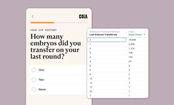
IVF is complex, and members often entered incorrect data. I used structured inputs to guide accuracy and reduce errors.
Reviewing submissions, we saw anomalies; like members reporting 20 embryo transfers when the UK limit is two. IVF involves a blur of numbers, from egg counts to transfer rounds, and mistakes are easy. By switching from free text to structured fields, we nudged users toward correct inputs and made it easier for our team to review and validate the data.
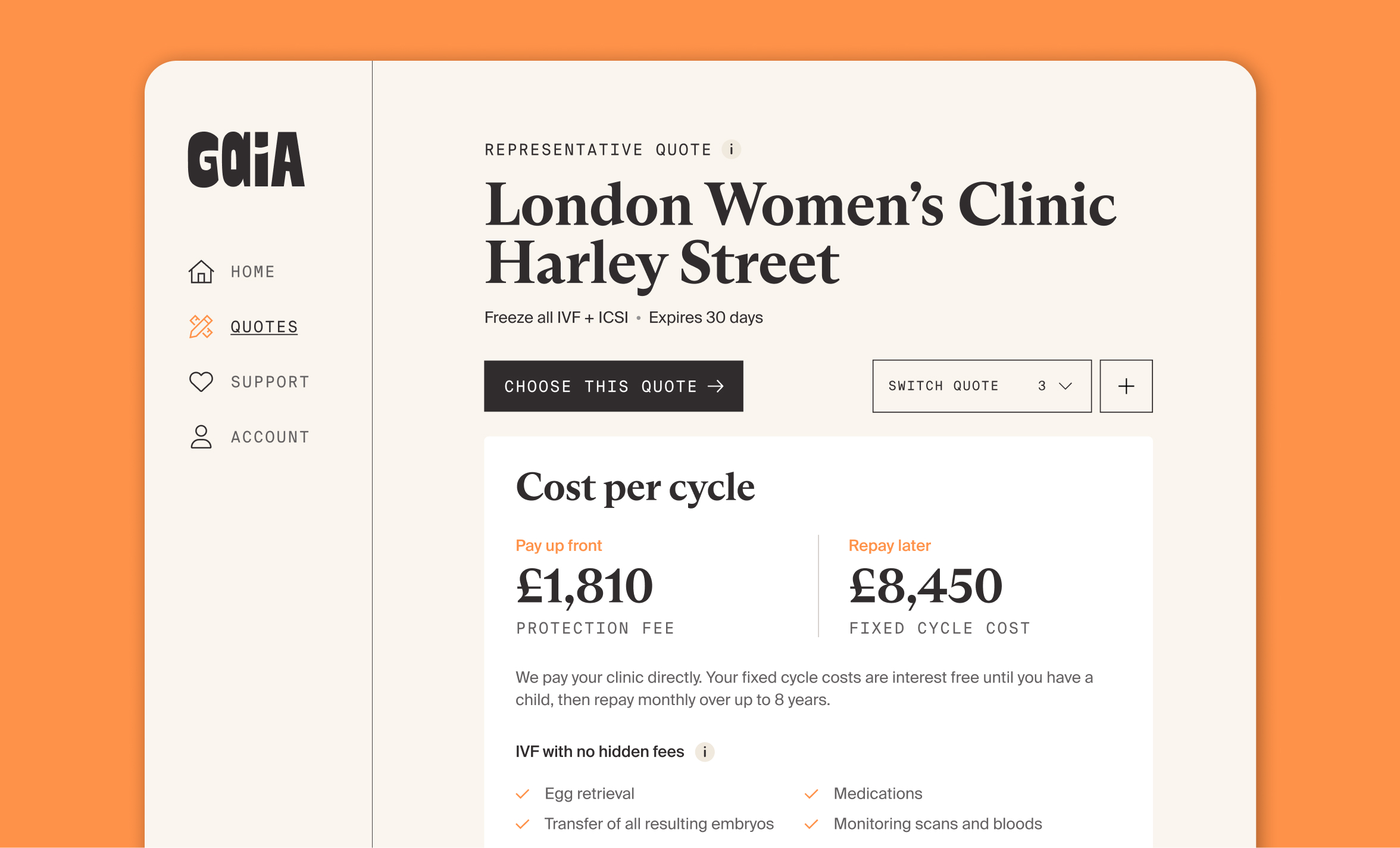
Misunderstanding IVF terminology was costing members money. I used progressive disclosure to improve data quality.
Members often misreported their diagnosis; not because they were careless, but because the terms were unfamiliar. These errors could significantly alter their quotes. I introduced progressive disclosure, using branching questions to uncover the right information step-by-step. This reduced confusion and led to more accurate, reliable submissions.
These changes weren’t just about smoother screens or cleaner forms—they were about restoring momentum for people at a vulnerable moment. Good design doesn’t just make things easier; it builds confidence. By redesigning Gaia’s onboarding, I helped more families move forward with clarity, support, and a greater sense of control at one of the most emotionally charged points in their lives.